Monday 23 December 2013

Ancillary Design Ideas


_____________________________________________________________
Font:
From the questionnaire responses we have decided to use small and subtle text. The focus will be on the image, however the text still needs to stand out in its own right and be readable.

Colours:
We plan to shoot the images and then edit them in to black and white. If the lighting however turns out to be worse than planned and natural lighting isn't sufficient enough to use the black and white effect we will have to resort to using the colour version.

Layout:
From the questionnaire it was decided that we would use a strong close-up for the cd cover and an image at one side for the back cover. Our flat plans will help us to decide on poses and layouts for the insert images, and we are fairly unlimited with what we can shoot as long as they are mid/close ups. For the magazine advertisement, we need to make sure that the image is portrait and covers an A4 page.

Connotations:
Our images should connote beauty, style and extravagant fashion to match our target audiences requests and also the genre of the music. Bella should be photographed in a way that promotes her strength as a solo female artist.
_____________________________________________________________

Thursday 12 December 2013

Evidence of Editing

_________________________________________________________________
The following clips are screenshots showing evidence of putting the clips of filmed footage into the final cut pro timeline, having to cut them down to the appropriate timings, and rendering the footage in order to further edit. 


The following image is a screenshot detailing further edited footage, however in this clip we are creating a title for the beginning of the video.  


_________________________________________________________________

Sunday 8 December 2013

Action Plan for Week Commencing

_________________________________________________________________

Action Plan:

  • We need to conduct further research in terms of feminism and cultural factors
  • A shot list needs to be produced
_________________________________________________________________

Deadlines


_________________________________________________________________

By the end of the term (20th December) the following must be completed:

1) Both ancillary tasks + all research, planning and drafting
2) All footage to be completed for main task + first draft on timeline with additional feedback (uploaded onto blog)
3) All research, planning and evidence of drafting for main task


_________________________________________________________________

Wednesday 4 December 2013

Unusable Footage

_________________________________________________________________


The video in this post shows examples of footage from our recent filming that cannot be used for the reasons noted within the video.

_________________________________________________________________

Monday 2 December 2013

Action Plan for Week Commencing


_________________________________________________________________

  • Name and organise new footage
  • Start edit decision list
  • Add footage into final cut pro
  • Begin editing processes
  • Shoot ancillary tasks
_________________________________________________________________

Sunday 1 December 2013

Comments on Day of Filming

_________________________________________________________________

Today, filming of the additional footage commenced as planned. We had to plan carefully due to the restricted hours of daylight, but we were able to capture all of the footage we planned to, and the weather and lighting was good. Both characters turned up as planned, and style and image wise were consistent with previous footage. We shot the footage with a cannon EOS 7D and made sure we had additional equipment that was necessary such as the tripod, and also the white screen we filmed in front of. We will now begin to sort this footage and decide which clips we will use, then we can start editing the footage and adding it into the storyboard alongside the footage we have already edited in final cut pro. 
_________________________________________________________________

Thursday 28 November 2013

Ancillary Flat Planning

_________________________________________________________________

We conducted planning for our CD covers, insert images, and magazine tour advertisement. This helped us to plan what images would be taken and where they would be used. This meant we knew exactly what props and clothing we needed, and how we wanted Bella to be styled, and ensured we knew what images we needed to shoot of Bella for each section of the ancillary production. We planned everything down to where the text would go, and this meant we could experiment with fonts and font sizes now we know where we want the text to go.

Magazine Tour Advertisement Plan
Insert Images Planning
Front and Back Cover Plans

_________________________________________________________________

Tuesday 26 November 2013

Shot List for Weekend Filming

_________________________________________________________________

    • 00:12-00:16 Bella crying
    • 00:16-00:20 Lee looking sad
00:20-00:35: group shots 
  • 00:20-00:25 waking up and packing
  • 00:25-00:30 packing the car
  • 00:30-00:35 motion scenes in the car - outside and inside
00:35-00:42: Bella singing up until 'never want it to go'
00:42-00:47: Nice gesture from lee to Bella
00:47-00:50: Opening door to flowers on doorstep
00:50-00:58: Car
  • 00:50-00:54 hand on gearstick 
  • 00:54-00:58 Bella singing into the mirror 
00:58-1:00: Clock Scene 'hungry for what was to come'
2:20-2:28: Walking along the A14 Bridge - focus on the traffic - cars slow motion
2:28-2:36: Shots of Lee
2:44-2:51: Early morning bed shot, Bella gets out, from above, white bed sheets 
4:14-4:23: Bella's crying shot played in reverse (in slow motion) so that the tears go up - she has been saved by walking away. 
_________________________________________________________________

Wednesday 13 November 2013

Action Plan for Week Commencing

_________________________________________________________________


Action Plan for Week Commencing:

  • Shoot draft images for ancillary task
  • Create mock ancillary tasks
  • Collect audience feedback on these
  • Start shooting and editing ancillary images
  • Film remaining footage
_________________________________________________________________

Tutorial Feedback

_________________________________________________________________

This following is information and feedback from the tutorial that has taken place with teachers this week:

- Successful work so far on ancillary
- Need to upload work to blog
- Should consider how important and urgent filming footage will be

_________________________________________________________________

Questionnaire Analysis of Magazine Advertisement

_________________________________________________________________
From the analysis of the questionnaire results, we found that this image was closest to what the target audience wanted.


This advertisement covered all the areas that the audience said they preferred such as:
- The main focus is on the image rather than the text
- There is information of where to buy the tickets
- The artists name is featured in the image
- It is a full page advertisement
- There is a similar colour scheme to the album cover

Although the advertisement covered all the above criteria, it did not meet the following criteria based around what the target audience said they wanted:
- either general image or album artwork on the advert (only 50% applies)
- consistent font used through the advertisement

^ therefore, we will try to adapt our own advertisement further to meet ALL or most of the criteria, but this image is useful as a base line as it covers a lot of the criteria.
_________________________________________________________________

Tuesday 12 November 2013

Questionnaire Analysis of Album Artwork

________________________________________________________________
From the questionnaire conducted on members of our target audience, we were able to take the images from the question on CD cover image preferences, and see which criteria each image covered based on what they said they wanted (roll over images to see which criteria applies to the image)


As you can see from rolling over the image, it is clear that image 1 (top left) and image 3 (top right) were most applicable to the set of criteria the target audience indicated in the questionnaire. Therefore, when creating our CD Cover image we need to keep these both in mind when planning so we can produce something that appeals to the target audience. Image 3 was nominated as having the best font, whilst fitting 5 of the criteria. However, image 5 (bottom middle) also fitted 4 criteria and was not far behind image 1, therefore we should also take this image into consideration when planning, All three images are quite similar, so if we keep them in mind we should produce an image similar to these. 
________________________________________________________________

Friday 8 November 2013

Ancillary Task Questionnaire

_________________________________________________________________
Follow the link for the rest of the Questionnaire...
________________________________________________________________

Wednesday 6 November 2013

Digipack Insert Mood Board

_________________________________________________________________


Above are a collection of images reflecting our initial ideas for the digipack insert photography. We want the theme to be natural and understated but at the same time still glamorous and reflective of the industry and as professional and realistic as possible, and we are looking to achieve this through the use of clothing and makeup for example, the use of fur coats, face paints etc. We are likely to use a range of mid-shots as we don't want to include to many close ups as to distract from the striking cover image, but we also want to avoid long shots due to the fact we still want the artist to be the main focus. We gained inspiration from these images, in specific the kaleidoscope image. The kaleidoscope imagery is something that is commonly featured in dance videos and therefore is very suited to the genre, and we also like the effectiveness and variety the image can create.

_________________________________________________________________

CD Album Cover Mood Board

_________________________________________________________________


Above is a mood board we have created in order to reflect ideas we have for the photography on the CD cover and also to gain inspiration. We decided to focus mainly on images of artist who work within a similar genre and also on images of females who have strong facial features like Bella who we are using as the model within our Digipack. By doing this firstly we can create images that we know work within the genre and appeal to the target audience, and also we can gain inspiration and ideas of how we can use Bella's full potential in the most effective way. We have decided from this that the image we use on the cover will most likely be a close up shot, from shoulders upwards at least. This is primarily because we do not want the background to be too distracting. Also I think that because strong close up shots are used throughout our production piece, this will be strongly relatable between the two, and we also prefer the look of a fuller album cover in terms of the image as it is more effective. At the moment, our preference would be a shot thats either set-up in front of a white background or a shot with background imagery (see image in top left) It will be at the audience feedback stage that we will be able to make a judgement on which will be most suitable.
_________________________________________________________________

Analysis of Existing Digi Packs

_________________________________________________________________


The above image details the album artwork from the album by Iggy Azalea. The images are very strong and effective. The vibrant white background not only makes the images appear classy and professional, but it also goes a long way in drawing the eye to the main focus of the images; Iggy herself. This is very much reflective of her character and the way she is portrayed in her music; as a strong independent young woman. The blonde hair and the red lips also breaks up the strong and effective black and white contrast which is used throughout the cover image and also the two images for the album insert. I think that these images will be highly influential on our own production and images as they are professional looking and very eye catching whilst being relatively easy to set up in a studio environment. This is something that is accessible to us and therefore I believe the simplistic, but striking nature of these images will be reflected in our own work.


The image above is the album cover, back cover and one image from the insert from Sky Ferreira's album 'One'. Once again, similarly to Iggy's album cover, the image is in black and white which works well for the image as accompanied with her facial expression and direct eye contact it creates a sense of story behind the image and has deeper depth and meaning, as well as creating a personal relationship with the consumer. The images from the inserts put emphasis on the importance of framing a shot. Both are close up/extreme close up shots, and personally I think if they had been framed from a medium shot perspective they would be a lot weaker and less aesthetically impressive. The black spacing behind the image works well in co-ordination with the text, however the font of the text is inconsistent, and so if we were to try and mimic something along these lines, we would have to ensure the font was consistent as this was something the target audience specified when questioned. Again, the target audience wanted consistent colour schemes and styles used throughout the images, and this does not meet those requirements. The images themselves are strong, but they do not work well together, and so this is something to consider when editing our images; it's important that they compliment one another and can stand alone and together.
The image above shows the front cover and two insert images from the album by Zebra Katz. Although the artist featuring in these photos is male, the artist operates in the same genre as the artist in our production, therefore their success within the same genre would suggest we should take note on the important features within the album artwork. The strong facial features are key to these images, and Bella, our actress and main artist has this in common with the artist, therefore this is something that we could focus on when shooting and editing. Also, the statement pieces such as the fur coat really draw the eye into these images, and make them even more effective, and so we should thoroughly consider using props such as the statement clothing or jewellery in our images. What makes this particularly successful as imagery is the fact that the images are strong individually, but also equally as strong together and they compliment one another very well; this is something we need to aim for. Again, these images are fairly simple to create in a studio environment with a white screen, and I think that pursuing this idea would be best as the images it creates are eye-catching and attention is drawn to the artist and the artist style; which is a strength of ours because of our carefully selected characters with individual looks. 


The above is the album cover and two insert images from the album by Faarrow. Alike Iggy Azalea and Sky Ferreira, the image on the front is in black and white, featuring no other colours however like the blonde hair or red lips in Iggy's. I think that in our production even if we chose black and white for the main body and theme of the images, we should incorporate small areas of colour as I think it makes the image stronger and more eye catching. There is an evident focus within this artwork on the artist's facial expression and style. This is something that we need to focus on within our production, and again props such as clothing will be essential to get right in terms of the genre and target audience. The eye contact made in these photos creates personal relationships and makes the images more captivating, and so I think the majority of our images, with a few exceptions, should be eye-contact images. The framing of these insert images is also key to their success, with the sepia filter on top. I think that the framing is something we need to consider greatly as it has a huge effect on the strength of the image. Even though two artists feature in these images, it is something we should transfer into our own production with Bella, as framing is of paramount importance.
_________________________________________________________________

Monday 4 November 2013

Action Plan for the Week Commencing

_________________________________________________________________


Below are the list of things we need to work towards in the week commencing
  • Finish initial ideas for ancillary tasks
  • create mood-boards for each section of ancillary tasks
  • conduct research into digipacks
  • film footage
Unfortunately when we planned to film this weekend, Bella had to urgently be called into work therefore we had to rearrange to the next weekend.
_________________________________________________________________

Thursday 31 October 2013

Funding

_____________________________________________________________

If we were to release this as a music video, we would have to gain funding in order to do so. This could come from various places for example...


The funding we received or institutions we approached would be heavily reliant on how successful the song was as a video would need to make the song more popular and increase record sales. The funding received would also depend on the popularity and status of the artist, and also the status of the record label itself.
_____________________________________________________________

Wednesday 30 October 2013

Story line Alterations


_________________________________________________________________

KEY
Each colour text corresponds to a location
The blue text indicates areas shot on Brighton Beach
The purple text indicates shots located in and around the house/local area (Burton Latimer)
The pink text indicates shots located at the party/club


00:00-00:04: Panning shot of locations e.g. beach
00:04-00:20: On the beach, introducing characters
    • 00:04-00:08 introducing bella
    • 00:08-00:12 introducing lee
    • 00:12-00:16 Bella crying
    • 00:16-00:20 Lee looking sad
00:20-00:35: group shots 
    • 00:20-00:25 waking up and packing
    • 00:25-00:30 packing the car
    • 00:30-00:35 motion scenes in the car - outside and inside
00:35-00:42: Bella singing up until 'never want it to go'
00:42-00:47: Nice gesture from lee to Bella
00:47-00:50: Opening door to flowers on doorstep
00:50-00:58: Car
    • 00:50-00:54 hand on gearstick 
    • 00:54-00:58 Bella singing into the mirror 
00:58-1:00: Clock Scene 'hungry for what was to come'
1:00-1:04: Bella singing on the beach 'now I'm longing for the way I was' 
    • 1:04-1:08: Pulling up to the beach
    • 1:08-1:12: Shot of the beach
    • 1:12-1:16: Getting the stuff out of the car
    • 1:16-1:20: Casual beach shots
1:20-1:28: Argument of over shoulder shot leading up to lyric 'if your love isn't strong'
1:23-1:26: Argument from mid shot leading up to same lyric
1:26-1:27: 'If your love isn't strong' lyric from over shoulder shot
1:28-1:35: Back to back scenes: sitting back to back and Lee looks at another girl
1:35-1:58: Crowd shots, slow motion dancing and general party environment
1:58-2:20: Looking across the room, Lee is flirting with other girls, Bella storms out 
2:20-2:28: Walking along the A14 Bridge - focus on the traffic - cars slow motion
2:28-2:36: Shots of Lee
2:36-2:44: depth of field shot of Bella walking behind Lee
2:44-2:51: Early morning bed shot, Bella gets out, from above, white bed sheets
2:51-3:06
    • 2:51-2:56: Holding hands shot, played in reverse (editing)
    • 2:56-3:06: Bella singing 'say you'll save me'
3:06-3:16: Shots of Bella looking sad/depressed in different places
3:16-3:21: Shots of Lee and Bella looking over pier into panning shot of beach
3:21-3:24: Really fast flicking between scenes
3:24-3:29: ^ this carries on with Bella faded on top singing 
3:29-3:36: Bella dancing on her own in the middle of the crowd/people
3:36-3:42: Bella arguing on the street with Lee
3:42-3:49: Bella on the beach singing up to 'would it ever be enough'
3:49-3:59: Bella confiding in somebody else, Lee sitting on his own
3:59-4:06: Bella and lee holding hands walking forward, zoom into hands and play 2nd half backwards (editing)
4:06-4:14: Bella walking away on the beach, panning shot to reveal lee 
4:14-4:23: Bella's crying shot played in reverse (in slow motion) so that the tears go up - she has been saved by walking away. 

_________________________________________________________________

Monday 28 October 2013

Action Plan for Week Commencing

_________________________________________________________________

Action Plan:

  • Further research and Planning into ancillary task (Digi Packs)
  • Plan a date to film remainder of footage
  • Film the remaining footage
  • Create an edit decision list
_________________________________________________________________

Wednesday 9 October 2013

Audience Feedback

_________________________________________________________________

Before starting to edit our clips into the storyboard order on Final Cut Pro, we showed the clips to our peers and teachers in order to get feedback on which clips were most effective and which clips we definitely could not use. This was some of the most common feedback we received about our footage:

Good:
The footage looks professional
The lighting is strong and impressive
The shots are framed very well
The story line is easily understood
The actors look stunning and professional
The actors are believable

Bad:
Some shots are slightly shaky
Some of the miming shots are out of time
The male actor is squinting in some shots 
The panning in some shots is jumpy 

From this feedback, we were able to categorise each clip into good and bad folders and narrow down the large amount of footage we filmed to the best shots. 

Positive feedback is useful to us to make sure that we carry this over to future filming to make it consistent with the high quality footage we already have. However with the negative comments we could come up with a list of things to bare in mind and adapt our filming to:
1. Ensure the tripod is used for every shot unless not possible due to angles etc.
2. Ensure multiple shots are taken of miming scenes to make sure we can chose the most accurate shot out of this in terms of lip-sync
3. Ensure the actors are in positions where they can focus to the light without adjusting their vision or appearance
4. When panning we need to ensure a consistent constant speed and try to be as smooth as possible

_________________________________________________________________

Tuesday 8 October 2013

Filming Evidence

_________________________________________________________________

We decided on the day that we would use the spare camera to evidence the process of filming. The beginning two clips show Millie and myself filming the footage, and the following two are examples of footage we were unable to use. This was because of several reasons. The first was because the tripod was in the shot, therefore we cannot use it due to the fact it looks staged and unprofessional. The second shot shows the 'Brighton' sign has extras in the background. Firstly this is distracting to the audience watching as they may get the idea that they're relevant to the footage, and secondly it we do not have their permission for them to be in the shot.


_________________________________________________________________

Edit Decision Lists


_________________________________________________________________

Monday 7 October 2013

Analysis of Existing Magazine Advertisements (Ancillary)

_________________________________________________________________

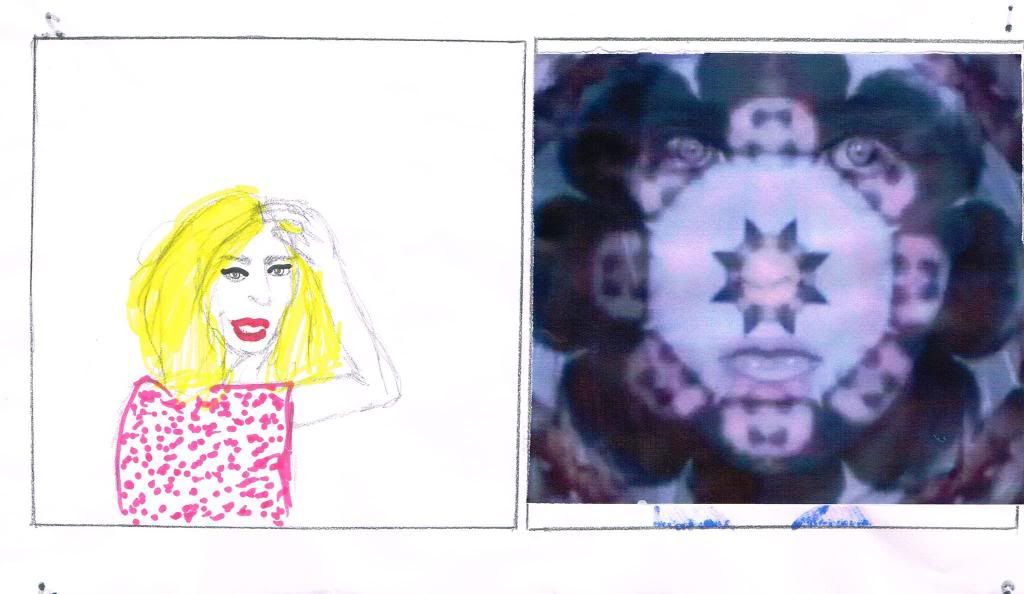
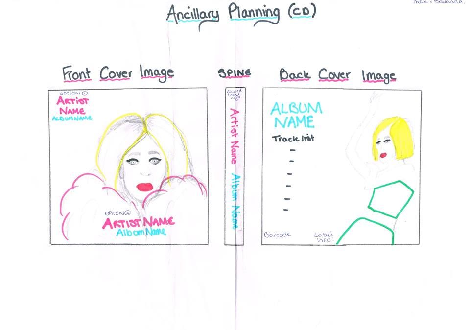
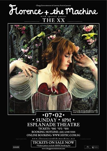
This first advertisement is for Florence and the Machine's tour with The XX. The album artwork is heavily featured in this advertisement and the block black coloured background used puts emphasis on this image and draws your eye in. This is important as consumers will most likely recognise the album artwork before they read what the advert is about, and so it has to catch their attention, which I believe it does successfully. Also, it promotes the album as well as the tour. The fonts are cleverly used to distinguish between florence and the XX as these are the fonts usually assigned and commonly       
associated with each of the artists; therefore they are highly recognisable. The date of the tour, including day, time and place are a main feature of this advertisement, and even though our production will see several dates listed, it is important that attention is drawn to them like in this advertisement, which I think is primarily down to the white/black contrast. There is also information of where and how to buy tickets which should feature in our own production. All the necessary information is featured and eye-catching however it doesn't dominate the advertisement, and this is why this advertisement is particularly successful.     

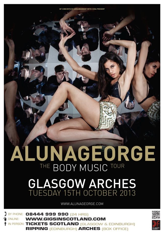
The second advertisement is for  AlunaGeorge's album tour named 'Body Music' after the album title. The album artwork again is heavily featured in this advertisement which appears to be a main aspect of most of the album tour  advertisements featuring in magazines; and I believe this is because in a magazine it is essential to create a page that is captivating and eye-catching due to the ease of flicking straight past it. The image is accompanied by the duo's name 'AlunaGeorge' in a bold strong font in a complimenting colour that works well with colours featuring in the image. The image itself is busy and is not just a basic image, which in itself makes the audience stop and look, and so we should consider this when planning our advert images. Again, the tour dates and location feature in the advertisement. Information of where to buy the tickets is then in a separate section, and I think this works well as this information could be easily lost due to the striking imagery used. This is something that we need to keep in mind as we do not want to lose smaller detail text with the large artwork and tour date info.                                                                                                                                           

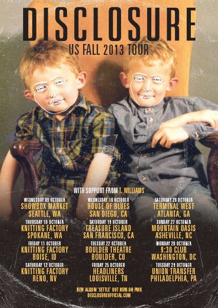
The third advertisement is noticeably different in terms of the image used as the image continues over the entire page, where as in the other three advertisements, the album artwork is either restricted to a square on the page, or fades into a block colour so that text can feature on top of it and still be noticed. I think that this advertisement works well like this, but I feel adverts like that from AlunaGeorge where the image fades looks more aesthetically pleasing and isn't too much on the eye, as the text on this advert doesn't stand out on the page in the same way. However that being said, this image is very popular and distinctive and is very popular and easily associated with Disclosure, so in this case it works to their advantage having such a strong image covering the entire page. The artist name 'Disclosure' features at the top of this page in a bold capital font and the image has been worked so that there is space for this. This layout is more alike to what we will produce as there are several tour dates listed. The consistent use of font throughout this tour advertisement works effectively, and this also co-ordinates with what the target audience would prefer. There is also a link at the bottom of the page to direct the consumer to a website they can buy the album from. This is something that is commonly featured in the tour advertisements, and it appears that it is used as an additional album sale strategy. 


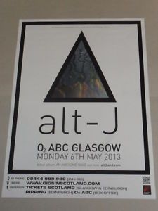
The final advertisement is of Alt J's tour at the O2 in Glasgow. This advertisement features an image influenced by the album artwork; however it is not identical. I think this is enough to be recognisable bfans of the album and the band, and the large font helps to identify which band is being advertised if there was any doubt because of the simplicity of the image. I think the simplistic take on this advertisement makes it particularly successful, as they're able to promote and be recognised with minimum effort, and in this case it appears that less is more. All of the information that is needed is printed clearly and the information of where to buy the tickets is featured in a separate section of the page, at the bottom. I think that this could influence our work as it communicates clearly the fact that the page should not be too busy, and only vital information should feature so that it is not too much to comprehend at a glance. If there was too much text or it was laid out in such way that it was difficult or effort to read, the consumers would most likely look past it. The font is used cleverly in this advertisement as the font used for the information is consistent and bold however the font used for the band name is their signature font that is associated with the band; therefore we should consider using the same font for the band name on both the CD cover and the advertisement. 
_________________________________________________________________