Thursday 28 November 2013

Ancillary Flat Planning

_________________________________________________________________

We conducted planning for our CD covers, insert images, and magazine tour advertisement. This helped us to plan what images would be taken and where they would be used. This meant we knew exactly what props and clothing we needed, and how we wanted Bella to be styled, and ensured we knew what images we needed to shoot of Bella for each section of the ancillary production. We planned everything down to where the text would go, and this meant we could experiment with fonts and font sizes now we know where we want the text to go.

Magazine Tour Advertisement Plan
Insert Images Planning
Front and Back Cover Plans

_________________________________________________________________

Tuesday 26 November 2013

Shot List for Weekend Filming

_________________________________________________________________

    • 00:12-00:16 Bella crying
    • 00:16-00:20 Lee looking sad
00:20-00:35: group shots 
  • 00:20-00:25 waking up and packing
  • 00:25-00:30 packing the car
  • 00:30-00:35 motion scenes in the car - outside and inside
00:35-00:42: Bella singing up until 'never want it to go'
00:42-00:47: Nice gesture from lee to Bella
00:47-00:50: Opening door to flowers on doorstep
00:50-00:58: Car
  • 00:50-00:54 hand on gearstick 
  • 00:54-00:58 Bella singing into the mirror 
00:58-1:00: Clock Scene 'hungry for what was to come'
2:20-2:28: Walking along the A14 Bridge - focus on the traffic - cars slow motion
2:28-2:36: Shots of Lee
2:44-2:51: Early morning bed shot, Bella gets out, from above, white bed sheets 
4:14-4:23: Bella's crying shot played in reverse (in slow motion) so that the tears go up - she has been saved by walking away. 
_________________________________________________________________

Wednesday 13 November 2013

Action Plan for Week Commencing

_________________________________________________________________


Action Plan for Week Commencing:

  • Shoot draft images for ancillary task
  • Create mock ancillary tasks
  • Collect audience feedback on these
  • Start shooting and editing ancillary images
  • Film remaining footage
_________________________________________________________________

Tutorial Feedback

_________________________________________________________________

This following is information and feedback from the tutorial that has taken place with teachers this week:

- Successful work so far on ancillary
- Need to upload work to blog
- Should consider how important and urgent filming footage will be

_________________________________________________________________

Questionnaire Analysis of Magazine Advertisement

_________________________________________________________________
From the analysis of the questionnaire results, we found that this image was closest to what the target audience wanted.


This advertisement covered all the areas that the audience said they preferred such as:
- The main focus is on the image rather than the text
- There is information of where to buy the tickets
- The artists name is featured in the image
- It is a full page advertisement
- There is a similar colour scheme to the album cover

Although the advertisement covered all the above criteria, it did not meet the following criteria based around what the target audience said they wanted:
- either general image or album artwork on the advert (only 50% applies)
- consistent font used through the advertisement

^ therefore, we will try to adapt our own advertisement further to meet ALL or most of the criteria, but this image is useful as a base line as it covers a lot of the criteria.
_________________________________________________________________

Tuesday 12 November 2013

Questionnaire Analysis of Album Artwork

________________________________________________________________
From the questionnaire conducted on members of our target audience, we were able to take the images from the question on CD cover image preferences, and see which criteria each image covered based on what they said they wanted (roll over images to see which criteria applies to the image)


As you can see from rolling over the image, it is clear that image 1 (top left) and image 3 (top right) were most applicable to the set of criteria the target audience indicated in the questionnaire. Therefore, when creating our CD Cover image we need to keep these both in mind when planning so we can produce something that appeals to the target audience. Image 3 was nominated as having the best font, whilst fitting 5 of the criteria. However, image 5 (bottom middle) also fitted 4 criteria and was not far behind image 1, therefore we should also take this image into consideration when planning, All three images are quite similar, so if we keep them in mind we should produce an image similar to these. 
________________________________________________________________

Friday 8 November 2013

Ancillary Task Questionnaire

_________________________________________________________________
Follow the link for the rest of the Questionnaire...
________________________________________________________________

Wednesday 6 November 2013

Digipack Insert Mood Board

_________________________________________________________________


Above are a collection of images reflecting our initial ideas for the digipack insert photography. We want the theme to be natural and understated but at the same time still glamorous and reflective of the industry and as professional and realistic as possible, and we are looking to achieve this through the use of clothing and makeup for example, the use of fur coats, face paints etc. We are likely to use a range of mid-shots as we don't want to include to many close ups as to distract from the striking cover image, but we also want to avoid long shots due to the fact we still want the artist to be the main focus. We gained inspiration from these images, in specific the kaleidoscope image. The kaleidoscope imagery is something that is commonly featured in dance videos and therefore is very suited to the genre, and we also like the effectiveness and variety the image can create.

_________________________________________________________________

CD Album Cover Mood Board

_________________________________________________________________


Above is a mood board we have created in order to reflect ideas we have for the photography on the CD cover and also to gain inspiration. We decided to focus mainly on images of artist who work within a similar genre and also on images of females who have strong facial features like Bella who we are using as the model within our Digipack. By doing this firstly we can create images that we know work within the genre and appeal to the target audience, and also we can gain inspiration and ideas of how we can use Bella's full potential in the most effective way. We have decided from this that the image we use on the cover will most likely be a close up shot, from shoulders upwards at least. This is primarily because we do not want the background to be too distracting. Also I think that because strong close up shots are used throughout our production piece, this will be strongly relatable between the two, and we also prefer the look of a fuller album cover in terms of the image as it is more effective. At the moment, our preference would be a shot thats either set-up in front of a white background or a shot with background imagery (see image in top left) It will be at the audience feedback stage that we will be able to make a judgement on which will be most suitable.
_________________________________________________________________

Analysis of Existing Digi Packs

_________________________________________________________________


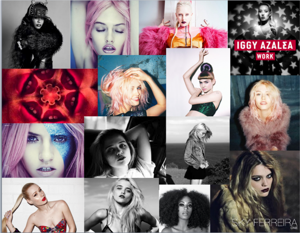
The above image details the album artwork from the album by Iggy Azalea. The images are very strong and effective. The vibrant white background not only makes the images appear classy and professional, but it also goes a long way in drawing the eye to the main focus of the images; Iggy herself. This is very much reflective of her character and the way she is portrayed in her music; as a strong independent young woman. The blonde hair and the red lips also breaks up the strong and effective black and white contrast which is used throughout the cover image and also the two images for the album insert. I think that these images will be highly influential on our own production and images as they are professional looking and very eye catching whilst being relatively easy to set up in a studio environment. This is something that is accessible to us and therefore I believe the simplistic, but striking nature of these images will be reflected in our own work.


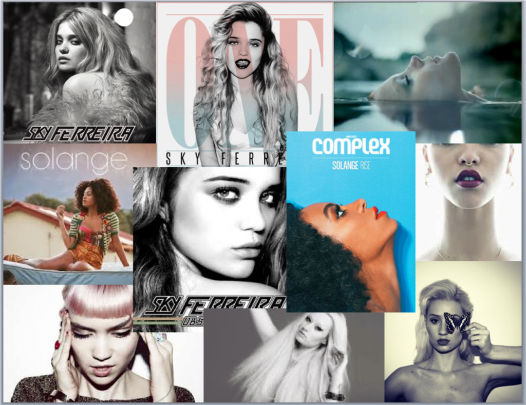
The image above is the album cover, back cover and one image from the insert from Sky Ferreira's album 'One'. Once again, similarly to Iggy's album cover, the image is in black and white which works well for the image as accompanied with her facial expression and direct eye contact it creates a sense of story behind the image and has deeper depth and meaning, as well as creating a personal relationship with the consumer. The images from the inserts put emphasis on the importance of framing a shot. Both are close up/extreme close up shots, and personally I think if they had been framed from a medium shot perspective they would be a lot weaker and less aesthetically impressive. The black spacing behind the image works well in co-ordination with the text, however the font of the text is inconsistent, and so if we were to try and mimic something along these lines, we would have to ensure the font was consistent as this was something the target audience specified when questioned. Again, the target audience wanted consistent colour schemes and styles used throughout the images, and this does not meet those requirements. The images themselves are strong, but they do not work well together, and so this is something to consider when editing our images; it's important that they compliment one another and can stand alone and together.
The image above shows the front cover and two insert images from the album by Zebra Katz. Although the artist featuring in these photos is male, the artist operates in the same genre as the artist in our production, therefore their success within the same genre would suggest we should take note on the important features within the album artwork. The strong facial features are key to these images, and Bella, our actress and main artist has this in common with the artist, therefore this is something that we could focus on when shooting and editing. Also, the statement pieces such as the fur coat really draw the eye into these images, and make them even more effective, and so we should thoroughly consider using props such as the statement clothing or jewellery in our images. What makes this particularly successful as imagery is the fact that the images are strong individually, but also equally as strong together and they compliment one another very well; this is something we need to aim for. Again, these images are fairly simple to create in a studio environment with a white screen, and I think that pursuing this idea would be best as the images it creates are eye-catching and attention is drawn to the artist and the artist style; which is a strength of ours because of our carefully selected characters with individual looks. 


The above is the album cover and two insert images from the album by Faarrow. Alike Iggy Azalea and Sky Ferreira, the image on the front is in black and white, featuring no other colours however like the blonde hair or red lips in Iggy's. I think that in our production even if we chose black and white for the main body and theme of the images, we should incorporate small areas of colour as I think it makes the image stronger and more eye catching. There is an evident focus within this artwork on the artist's facial expression and style. This is something that we need to focus on within our production, and again props such as clothing will be essential to get right in terms of the genre and target audience. The eye contact made in these photos creates personal relationships and makes the images more captivating, and so I think the majority of our images, with a few exceptions, should be eye-contact images. The framing of these insert images is also key to their success, with the sepia filter on top. I think that the framing is something we need to consider greatly as it has a huge effect on the strength of the image. Even though two artists feature in these images, it is something we should transfer into our own production with Bella, as framing is of paramount importance.
_________________________________________________________________

Monday 4 November 2013

Action Plan for the Week Commencing

_________________________________________________________________


Below are the list of things we need to work towards in the week commencing
  • Finish initial ideas for ancillary tasks
  • create mood-boards for each section of ancillary tasks
  • conduct research into digipacks
  • film footage
Unfortunately when we planned to film this weekend, Bella had to urgently be called into work therefore we had to rearrange to the next weekend.
_________________________________________________________________