Friday 28 February 2014

Shortlisted Image for Front Cover

_________________________________________________________________

This is the image that was chosen to be the front cover image due to the central positioning of the artist, the direct eye contact made, the high quality image and also the fact the pose shows off the fur coat which is a main prop that shows continuity across the digipack.


_________________________________________________________________

Thursday 27 February 2014

Magazine Advertisement: Final Product

_________________________________________________________________


_________________________________________________________________

Wednesday 26 February 2014

Selecting Images

_________________________________________________________________

From the images we captured, I went through them all and picked out a few to focus on that I thought would be most suitable for the magazine advertisement based on the needs and wants of the target audience and also based on existing media products. With this in mind, I selected the following three images in order to chose a final ancillary image from and begin the editing process.


1


2


3

_________________________________________________________________

Magazine Ad: The Editing Process

_________________________________________________________________


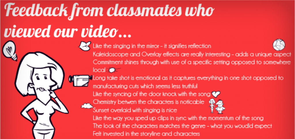
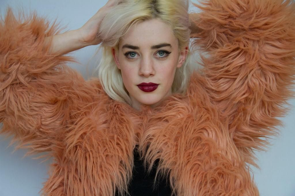
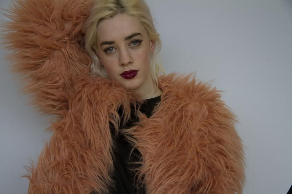
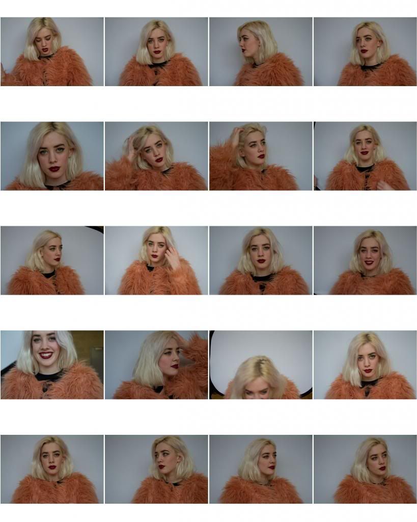
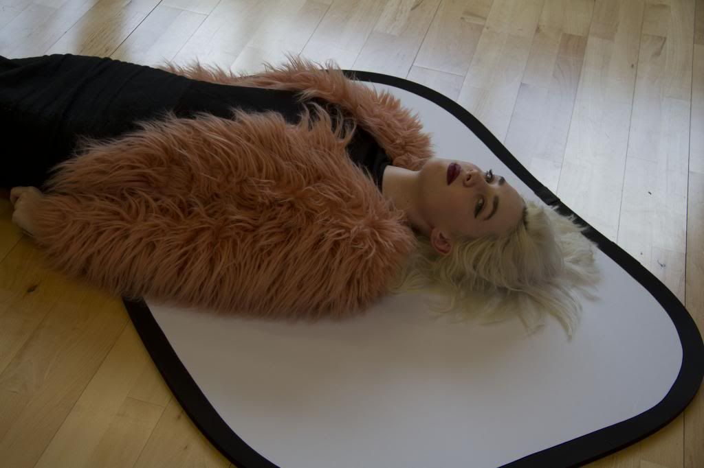
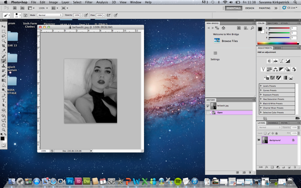
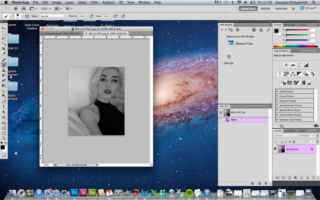
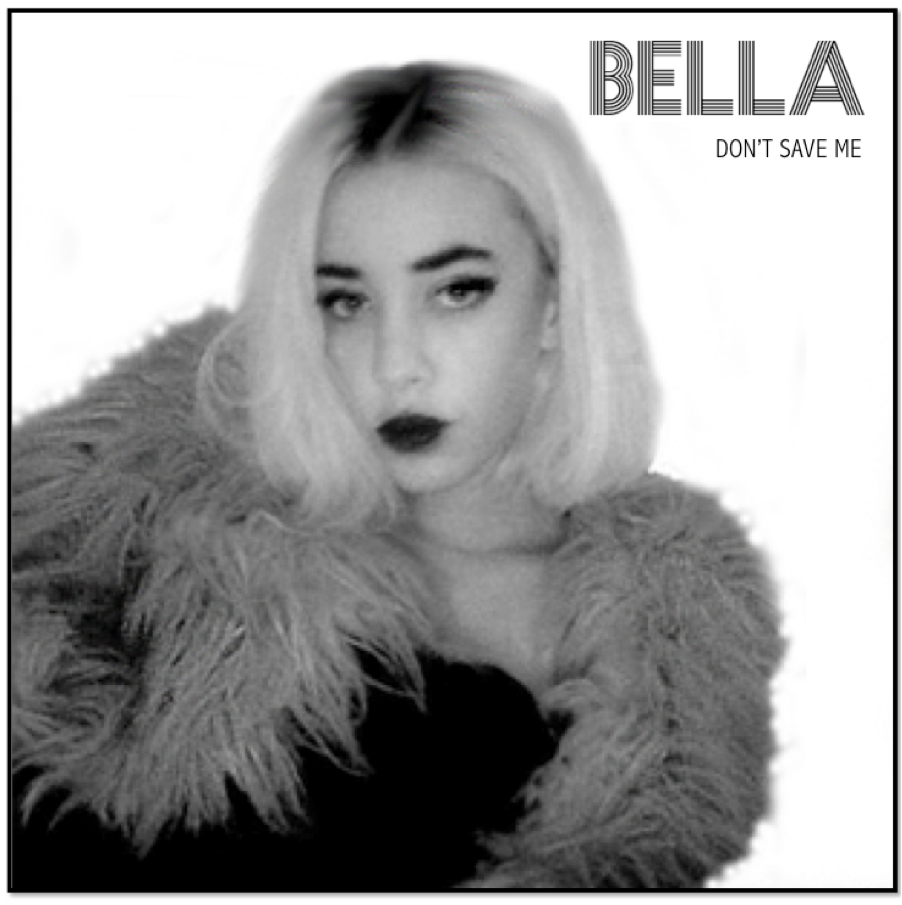
1 I chose Image 1 to use and develop into the final piece for the magazine advertisement as I thought it was most aesthetically pleasing, and suitable for the purpose of a portrait advertisement. In order to edit the original image, I first opened it in Photoshop. 


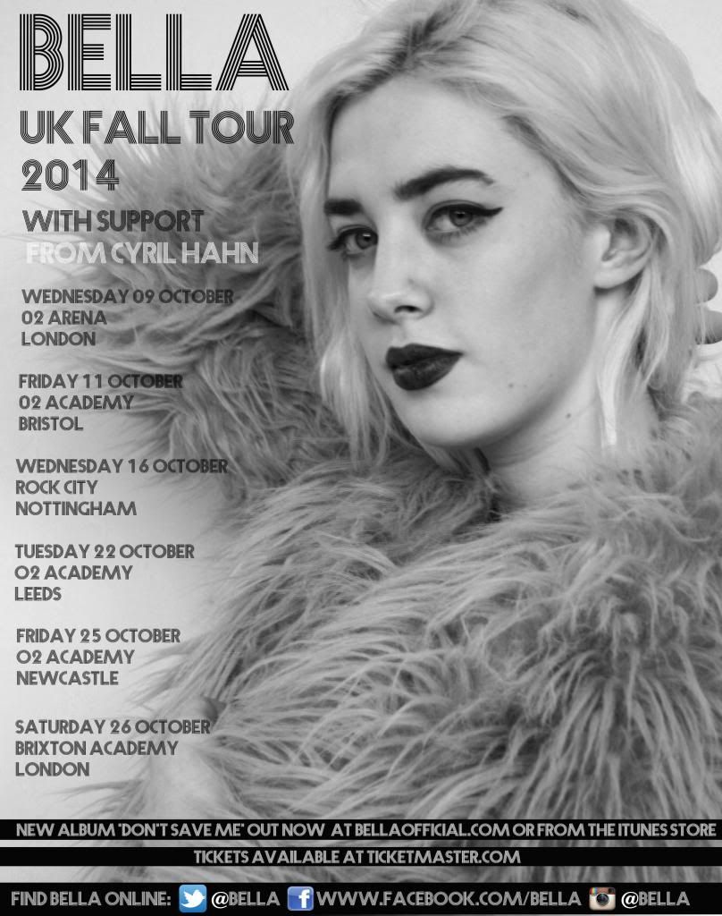
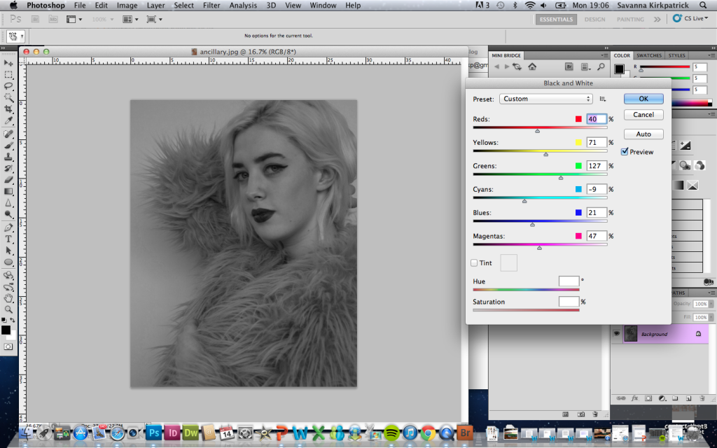
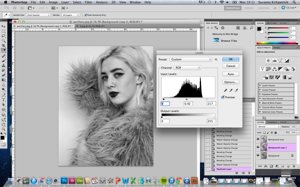
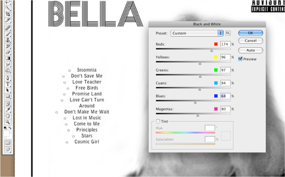
2 We decided in the planning and research stages that we wanted a black and white themed digi-pack. Therefore, the first editing process was to use the 'black and white' adjustment to turn my image into black and white. I adjusted each colour level in order to make the image look how i wanted it too, with lighter areas, and areas of more shadow and low-lights (the adjusting of the colour levels within the black and white adjustment is shown below in image 3)


3


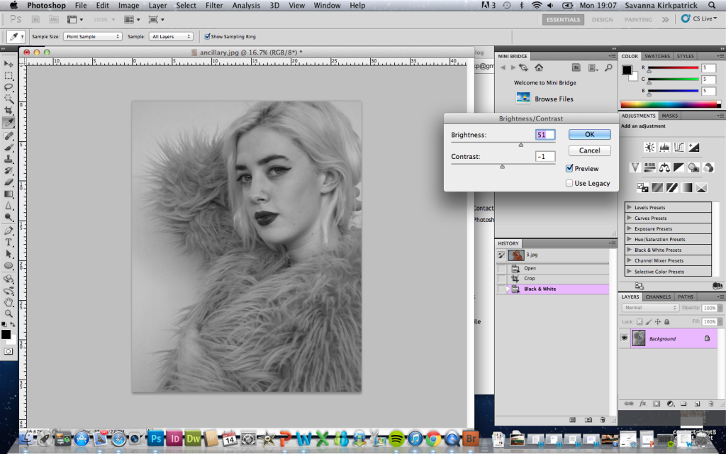
4 In this image, i am adjusting the brightness and contrast of the image. This helped me to achieve a more flawless glowing complexion, as well as lightening the background. This was an important step to make the image appear more professional, and also brighter, as the original image was quite dark, and since we didn't have use of any studio lighting in the photo shoot, the light had to be created synthetically through editing. This also increased the contrast, making her main features (eyes, lips, fur coat) stand out and appear bold and eye-capturing.


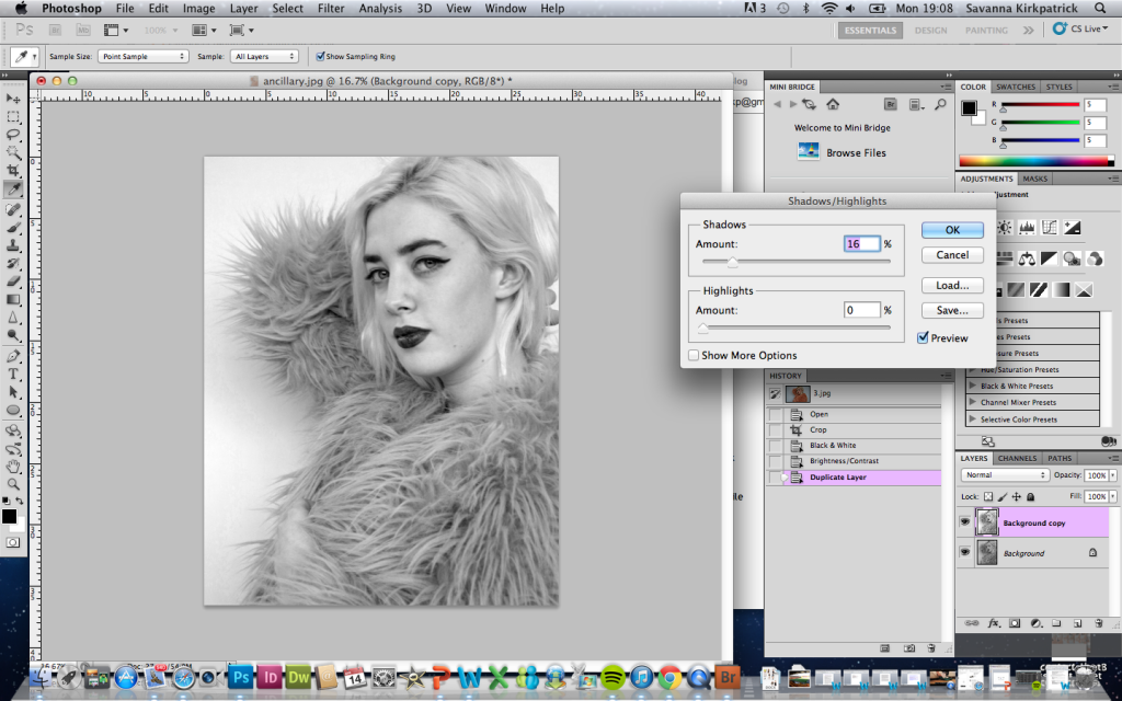
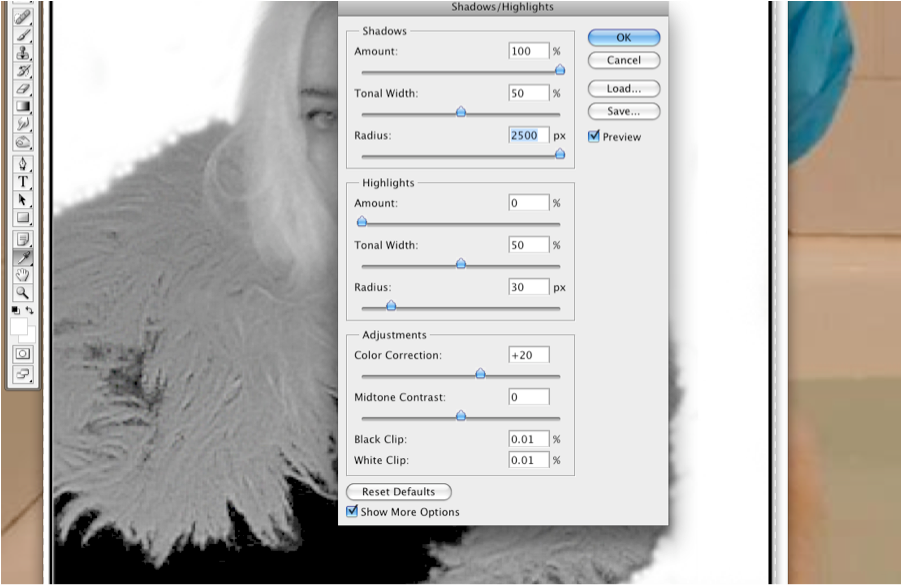
5 I felt like the image was still too dull, particularly the background. I needed there to be more variation between the black and white tones, and a more crisp white background so Bella stood out more. Therefore I began to adjust the shadows and highlights of the image. Decreasing both the shadows and highlights made for an even more professional looking image. The fur in her coat began to stand out a lot more from the background, as well as her facial features and hair.


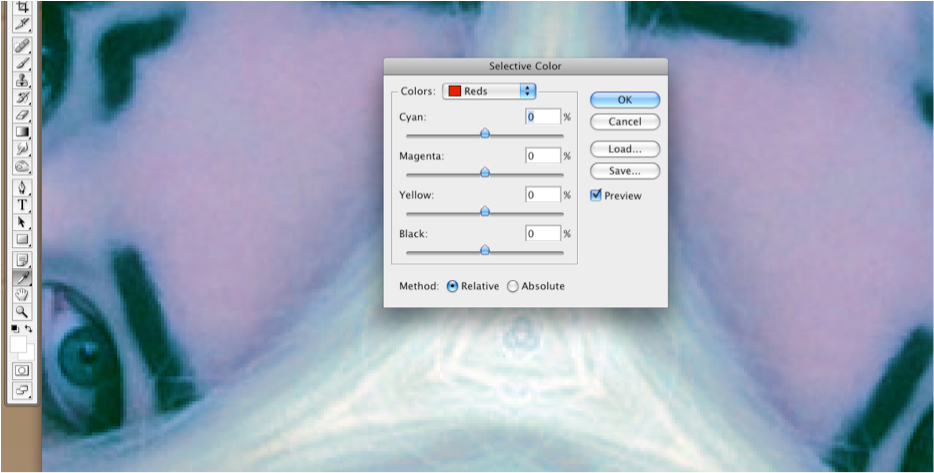
6 I continued to adjust the image further, and in this step i am adjusting the levels of the photo. This allowed me to make certain dark areas of the image darker, and some lighter areas more glowing. I chose to decrease the levels of her fur jacket, which introduced more texture and made the image look more 3D and less flat on the page. This also worked with the facial features such as eyebrows, eyes and lips. These are unique and distinctive features to Bella, that also stand out in the music video, therefore I wanted to ensure they stood out to their full potential and didn't sink into the background. I also made her skin more glowing for a more flawless complexion. This was an easier way to achieve the airbrushed effect that is seen in real media texts.


7 In this photo, I copied the background and set it to 'overlay'. This added further contrast and depth to the image as seen below.


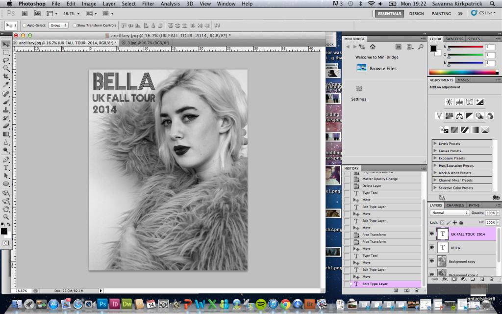
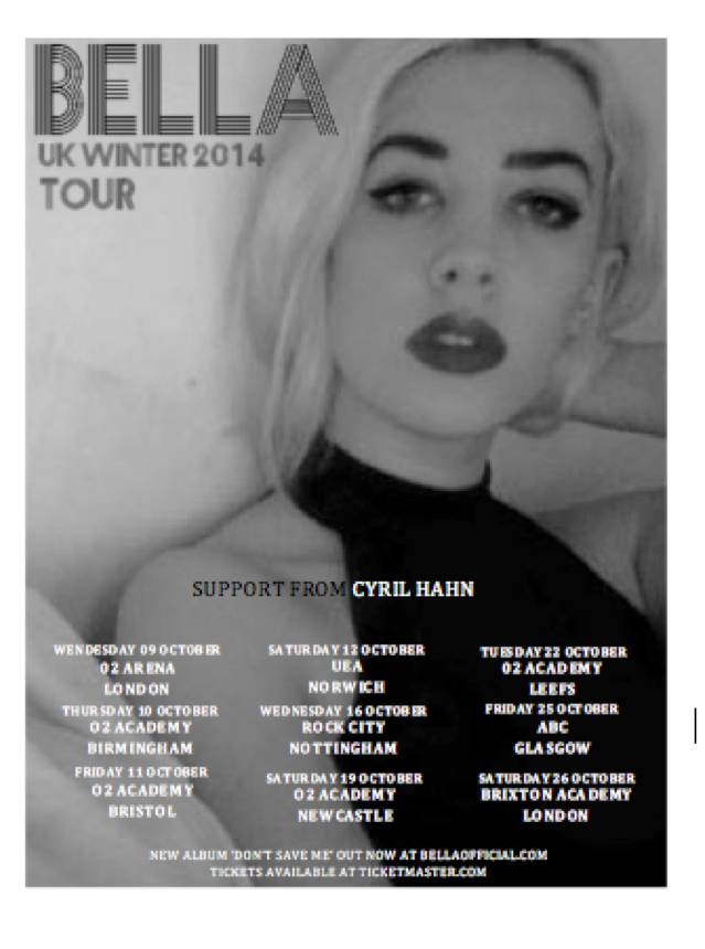
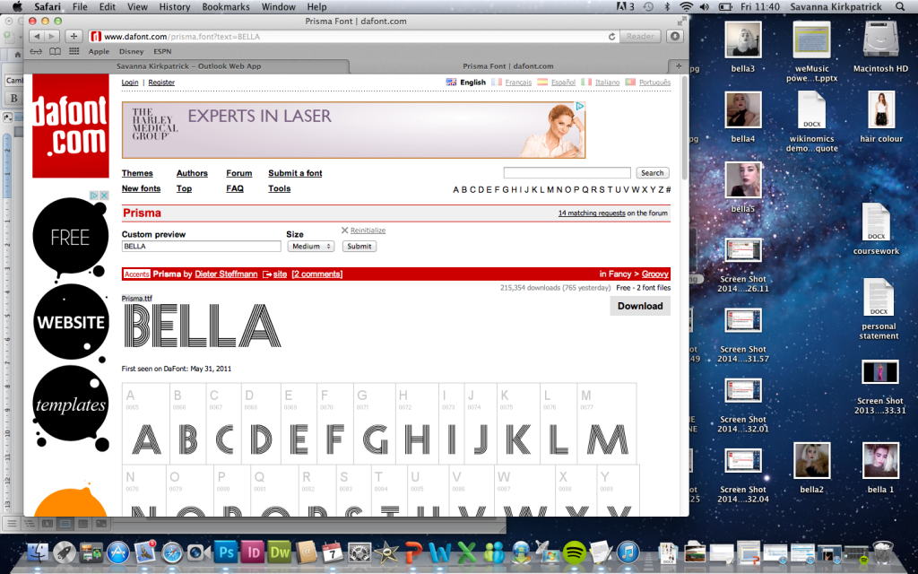
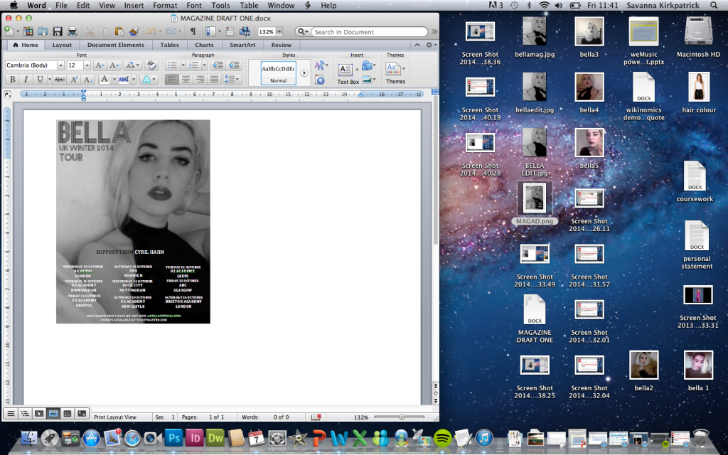
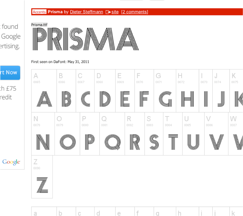
8 I downloaded the font 'Prisma' from an internet site for free, and opened it in Photoshop so it was ready to use. I then began adding in the text, as you can see here, I have inserted the header, located in the top left, as I thought this to be the most eye-catching location with the contrast between the white background and black text. 


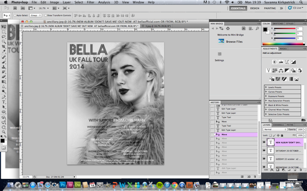
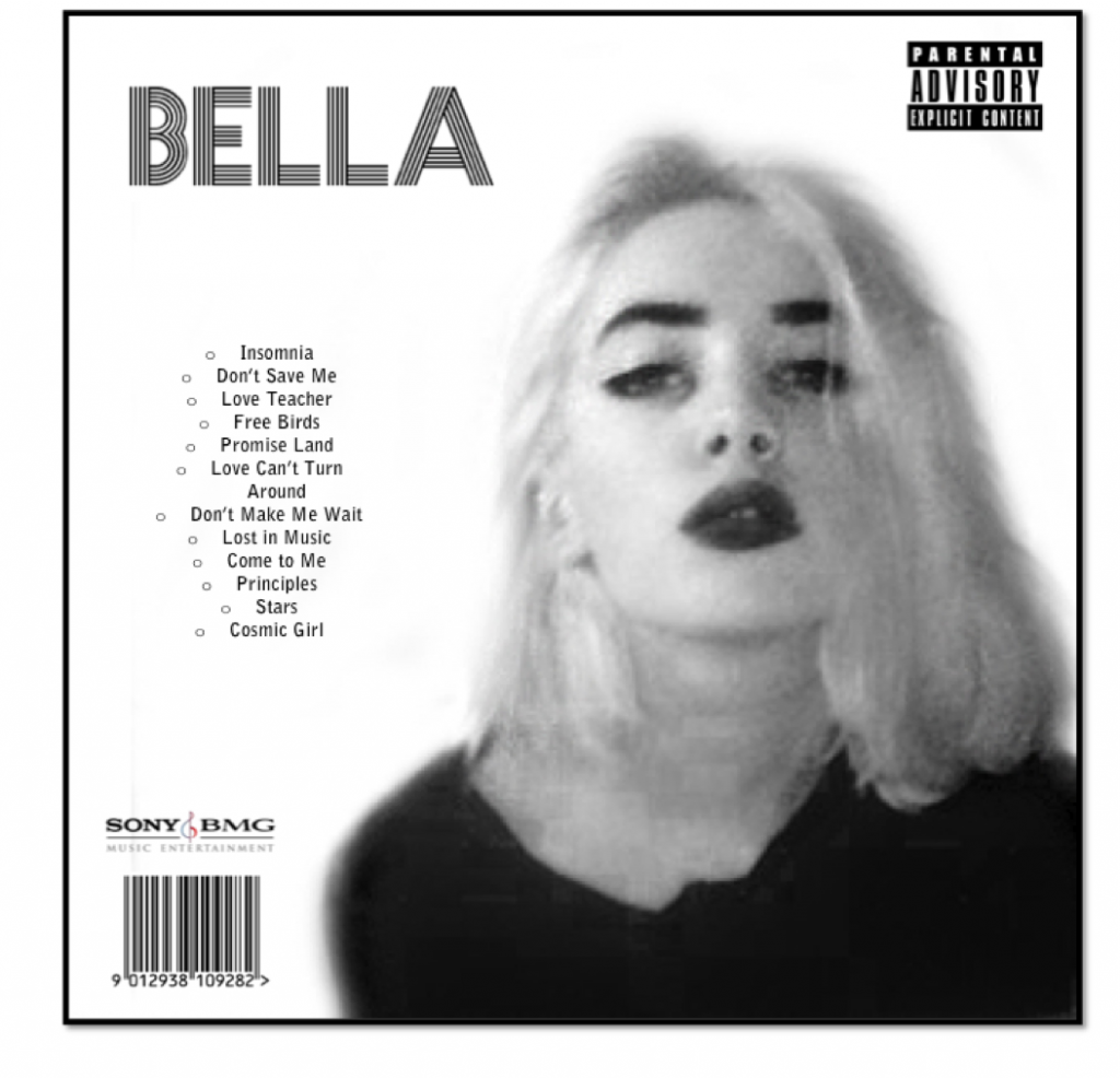
9 In the planning, I had originally decided to locate the text here, in the bottom 3rd of the page in the centre. However, the fur coat caught more light than anticipated, and if I were to add any more contrast it would look false and over-edited. Therefore, I had to think up a more suitable location for the text.


10 I decided that the left hand side of the page was far more suitable for the tour dates to be listed. The white background and black text contrasting makes a far-easier read in the list format, and also fills out the page and makes it look busier, but still remains simple and not over-crowded or overwhelming for the consumer. 

_________________________________________________________________

Tuesday 25 February 2014

Ancillary Images: Contact Sheets


_________________________________________________________________


Contact Sheet One


Contact Sheet Two


Contact Sheet Three


Contact Sheet Four

_________________________________________________________________

Thursday 20 February 2014

Ancillary Images: Photoshoot

_________________________________________________________________

For the ancillary images we used the same canon EOS 7D that we used to film the main production task as to keep the quality consistent across the media texts. We also utilised the white screen we also used whilst filming in order to get a crisp white background with limited shadowing and maximum light reflection (as shown in the photo below)


Bella posing on top of white screen


This fits with the background we planned when planning the images, and also will make it easier for us to edit in the editing process. Bella, featured as the model for this photo shoot, as she is the main actress in the production, and also the target audience questionnaire indicated that the artist as the main feature of the album cover and magazine article would be preferred.

When shooting, we took a lot of varied shot images, angles and poses in order to have choice when it came to selecting the images we would use in the final ancillary production, and also gave us back-ups if anything did not go as planned with certain images, for example, if one was out of focus.

In the following post, you can see the contact sheets that have been created, showing all the images captured on the shoot.

_________________________________________________________________

Tuesday 18 February 2014

Audience Feedback on Music Video

_________________________________________________________________


_________________________________________________________________

Friday 14 February 2014

Audience Feedback on mock Magazine Advertisement

Questionnaire


I conducted a short questionnaire on 30 members of the target audience, both male and female (including classmates) I did this in order to find out their thoughts on the first draft of the magazine advertisement so any improvements to be made could be highlighted and so the final product met their needs and wants. There are 6 questions each targeting different aspects such as text positioning, colour schemes, and image.  I also included a section for them to write three improvements. These were the results: 

Results from Questions 1-3
Results from Questions 4-5

Question One: It was fairly equal between those who did and did not like the placement of the text. This indicates to me that people have a range of opinions and therefore when it comes to the final piece if I chose to change the positioning of the text, this would probably work in my favour. However, as close to half of the audience liked the position, it is not essential.

Question Two: The black and white colour scheme was favoured by the audience therefore this is the style I will continue to use into the final piece

Question Three: A large number of the target audience members questioned said they felt the tour advertisement was lacking important information. I asked them to write down anything they thought was lacking and this proved in all cases to be information of where to find the artist online, on social media etc. and so this is something I will incorporate into the final design

Question Four: The audience members favoured her to be positioned at the side of the page. Therefore, I will ensure I capture images in the photo shoot that can be used both central, and to one side and see which I prefer.

Question Five: Is the advert eye catching enough? was an important question because magazine adverts are fiercely competitive and easily missed. I think I therefore need to edit the final image in a way that is striking and captivating, and catches the audience's attention overall.

Question Six: Question six could not be analysed by written feedback, instead the audience members had the option of writing down up to three improvements and these were the results:
  • 27 people said the quality of the image was not good enough
  • 11 said they would like use of more props, or creative clothing
  • 21 said they would like social networking information
  • 5 said they wanted a more striking pose
  • 4 said bolder text to be used 
  • 22 said there needed to be better lighting

Thursday 13 February 2014

Mock Magazine Advertisement

_________________________________________________________________

This is the final mock ancillary magazine advertisement. Problems with it include mainly the quality of the image and the font of the text used for the tour dates. However, both of these issues will be overcome on the final magazine advertisement as a high quality camera and tripod will be used and a better font will be finalised to use. Also, there will be more varied colours of text in the final version, as this mock image was quite restricting in terms of layout. 

_________________________________________________________________

Wednesday 12 February 2014

Final Music Video

_____________________________________________________________


_____________________________________________________________

Final Alterations to Storyline

_________________________________________________________________


The video inserted below shows the changes to the original narrative detailed in our storyboards at the research and planning stage. These were active decisions we made in order to make the narrative more clear, make use of good footage, fill in gaps or because some scenes we were unable to film and had to re-think and compromise. 
_________________________________________________________________

Quality of Final Music Video


This is a video clip (available in 720 HD) which shows the quality of the original raw footage. This shows that the quality of the footage was there, however was restricted by the editing software that we used.

_________________________________________________________________


Issues in Final Cut Pro

_________________________________________________________________

Final Cut Pro has raised several issues for us as producers, and our experience with it has not been overall very positive. The concerns and issues raised were the following:
1) Quality of the Sound
We had been working on the project, and after saving and reloading it the next day, Final Cut Pro had adjusted the audio we had inserted into the video. At a certain point in the video, the sound volume levels of the audio track increase noticeably. However, this was not something we were able to overcome without cutting this section out of the track. This would mean interrupting the continuity of the song and editing out lyrics that effected the narrative and over-all sync of the sound and visuals. Therefore, we had to leave it in. 
2) Rendering
A large proportion of the time we had devoted to editing the clips was spent on waiting for the clips to render. Every time we moved a clip, even if it were a second or two in front or behind its original placing, the clip, or sometimes several clips would need rendered. This was very time consuming and drew the editing process out longer than it needed to be.
3) Quality of the Visuals
When we inserted the clips into final cut pro, we noticed that the quality was dramatically reduced. However, when we watched the raw footage the quality was restored. We were limited with ways to overcome this without starting the whole project again with different editing software. However, we did not have the time or software that enabled us to do this. We were hoping that when we exported the clip back out of final cut pro into Quicktime player at the end of the production, the quality would increase, however, due to unknown circumstances, this was not the case, and the reduction in quality was something we had to accept.

_________________________________________________________________

Monday 10 February 2014

Audience Feedback on Mock Ancillaries (Digipack Images)

_________________________________________________________________

This is a collaboration of the audience feedback we gained when we showed a range of target audience members our mock ancillary task digipack images (which included the inserts) and asked them what they thought. We gained a mixture of positive and negative feedback; the positives being things such as they thought the product was unique and creative, and they would buy and be attracted to it if it were real. The negative aspects of the feedback included things such as the fact the images were blurry and unclear. Luckily, most of the negative feedback will be amended when it comes to the real ancillary product as we will be using higher quality cameras and editing.
_________________________________________________________________


Friday 7 February 2014

Magazine Advertisement First Draft

_________________________________________________________________                                   
 The following screen shots detail the editing process of the mock ancillary magazine advertisement:


This is the initial mock image of Bella inserted into Photoshop in order to edit it. It has already been converted into black and white and the colour levels have been changed to even the tones of the image and make it more flattering.


The paint tool was then used in photoshop in order to fill in the gap in Bella's dress. This meant that the text we would overlay in the advertisement is more visible and works better with the image.


I sourced the font we previously decided on from an online website, and created the text to be used as the title on the advertisement. In the final version, I will download the font into Photoshop so I can use it with ease at my dispense and downloading it will also ensure the quality of it is consistent.


In this screenshot of the editing process, I have edited the text onto the image I have saved from Photoshop and inserted into Microsoft Word. I have added the titles using the font from online, and continued to edit the advertisement in word as it was easier to work with when the font was not yet downloaded. However, in the final version I will do the majority of the editing process in Photoshop.


With the titles now on the poster, in this print screen you can see that I have edited in the tour dates and additional information such as the support act, website, and where to buy the tickets. On the real version, this will be in a different font (yet to be decided) that works well with the title font 'prisma'.
_________________________________________________________________

Final Kaleidoscope Insert Images

_____________________________________________________________


The image above are final edited images of the kaleidoscope inserts for the final Digipak. These have been edited by adjusting the hue and using the selective colour tool along with layering (mainly used for the lips) to add a colour effect which appeals and attracts the target audience of dance music and varies from the black and white images as to introduce variety without straying from the desired look.
_____________________________________________________________

Mock Font and Back Album Covers - Digipak

_____________________________________________________________

Above is a mock image of the front cover of our digipak. The white background is edited in to the image but this is something we will avoid having to do by taking the real images against a white screen. The prominent, small don't is relative to the target audience questionnaire as well as the glamorous image. Bella looks similar to what she does in the music video, and therefore the strong unique look will be recognisable in both the cd images and the music video. The quality of these particular images used in the drafts are poor, and we will use a better quality camera and more natural light when capturing the real images.

The image of the back cover is a mock which means the quality will be improved when the real images are used. However, it does still stick to the conventions of what would need to be included on the final version. The track-list, font,  barcode, record label, and parental advisory sticker will all feature on the final version and are likely to be included on a real album cover, which means this is as close to a real cd cover and as professional as possible. We also made sure that the images used had eye contact consistently to create a sense of personal relationship.

_____________________________________________________________


Mock Insert Images for Digipak

_____________________________________________________________


The image above is a mock image we have edited of Bella, our main character. In the digipak insert, we plan to have a range of images alternating between black and white posed profiles and coloured kaleidoscope images which work alongside our music video. These images don't necessarily have to have eye contact like the front and back cover images.


Above is a mock up of the kaleidoscope images that will feature in the album insert. We plan to keep these images in colour, however we do not want to stick to the natural colours of the original image. We want to edit the images with strong purple/red/blue tones and make it look slightly unnatural to match the dance genre and alternative audience we are aiming to attract and please.
_____________________________________________________________

Thursday 6 February 2014

Evidence of Editing Mock Ancillary Task

_____________________________________________________________
On the image below, the black and white tool is being used in photoshop to edit the original image carefully adjusting each colour level so areas don't appear too dark or too exposed, and her lips and eyes and facial features are more prominent.


In the image below, shadows and highlights are adjusted on the eyes and hair to make her facial features more prominent.


In the image below, the selective colour tool is being used to edit the colours in the image to give it a unrealistic or trance look so that the images fit tightly with the genre and audience


_____________________________________________________________

Tuesday 4 February 2014

Ancillary Planning - Fonts

_____________________________________________________________

For our ancillary tasks we researched different fonts online and experimented with different colours and styles in order to find one we were happy with to use on our ancillary tasks. Similar to the decision to keep the house style of images black and white, we decided that we would also keep the text black and white as this shows consistency and we feel it is most aesthetically pleasing. Below are fonts we shortlisted, and so far the favourite font seems to be 'prisma' shown at the top of the screenshots. However we will continue to research into different fonts and styles.

Once we have reached a decision on what font to use, we will download it into photoshop so we can use it.
_____________________________________________________________