Friday, 7 February 2014

Final Kaleidoscope Insert Images

_____________________________________________________________


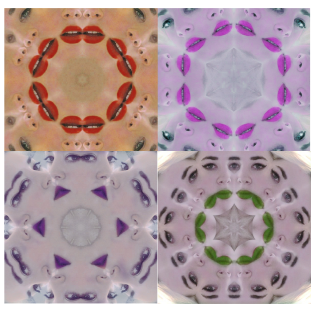
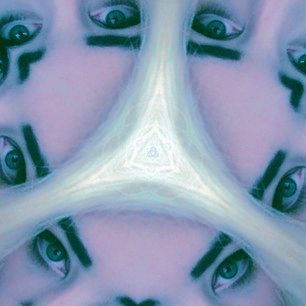
The image above are final edited images of the kaleidoscope inserts for the final Digipak. These have been edited by adjusting the hue and using the selective colour tool along with layering (mainly used for the lips) to add a colour effect which appeals and attracts the target audience of dance music and varies from the black and white images as to introduce variety without straying from the desired look.
_____________________________________________________________

Mock Font and Back Album Covers - Digipak

_____________________________________________________________

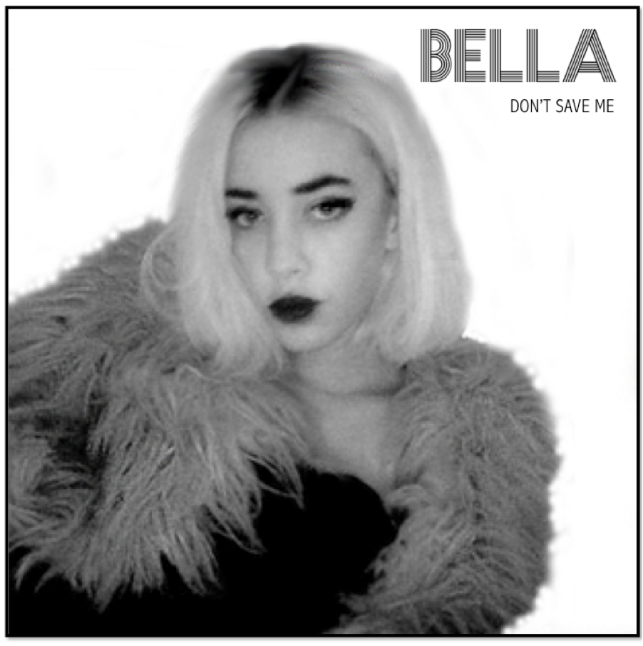
Above is a mock image of the front cover of our digipak. The white background is edited in to the image but this is something we will avoid having to do by taking the real images against a white screen. The prominent, small don't is relative to the target audience questionnaire as well as the glamorous image. Bella looks similar to what she does in the music video, and therefore the strong unique look will be recognisable in both the cd images and the music video. The quality of these particular images used in the drafts are poor, and we will use a better quality camera and more natural light when capturing the real images.

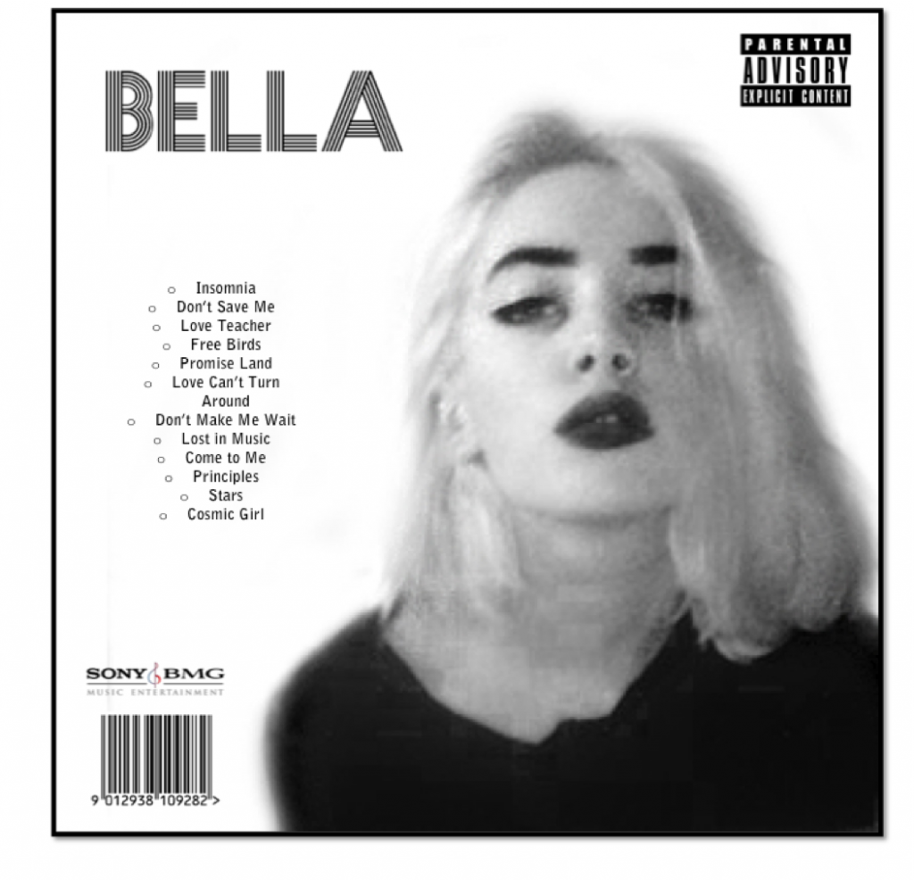
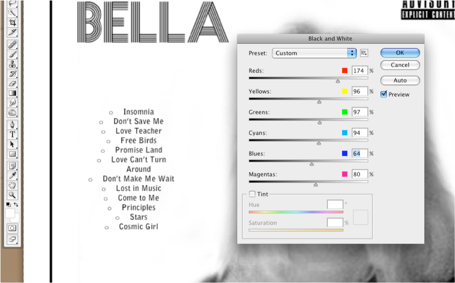
The image of the back cover is a mock which means the quality will be improved when the real images are used. However, it does still stick to the conventions of what would need to be included on the final version. The track-list, font,  barcode, record label, and parental advisory sticker will all feature on the final version and are likely to be included on a real album cover, which means this is as close to a real cd cover and as professional as possible. We also made sure that the images used had eye contact consistently to create a sense of personal relationship.

_____________________________________________________________

Mock Insert Images for Digipak

_____________________________________________________________


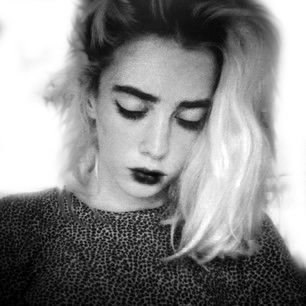
The image above is a mock image we have edited of Bella, our main character. In the digipak insert, we plan to have a range of images alternating between black and white posed profiles and coloured kaleidoscope images which work alongside our music video. These images don't necessarily have to have eye contact like the front and back cover images.


Above is a mock up of the kaleidoscope images that will feature in the album insert. We plan to keep these images in colour, however we do not want to stick to the natural colours of the original image. We want to edit the images with strong purple/red/blue tones and make it look slightly unnatural to match the dance genre and alternative audience we are aiming to attract and please.
_____________________________________________________________
Thursday, 6 February 2014

Evidence of Editing Mock Ancillary Task

_____________________________________________________________
On the image below, the black and white tool is being used in photoshop to edit the original image carefully adjusting each colour level so areas don't appear too dark or too exposed, and her lips and eyes and facial features are more prominent.


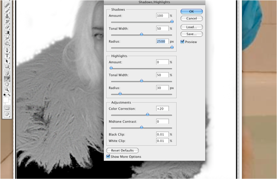
In the image below, shadows and highlights are adjusted on the eyes and hair to make her facial features more prominent.


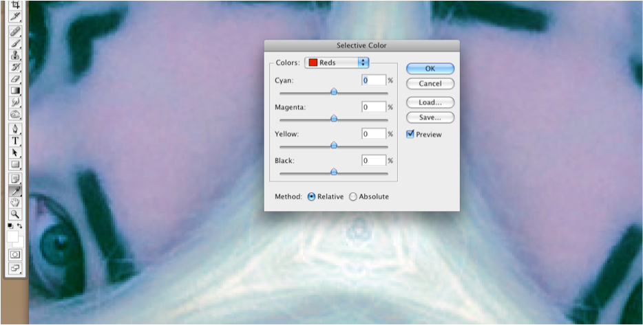
In the image below, the selective colour tool is being used to edit the colours in the image to give it a unrealistic or trance look so that the images fit tightly with the genre and audience


_____________________________________________________________
Tuesday, 4 February 2014

Ancillary Planning - Fonts

_____________________________________________________________
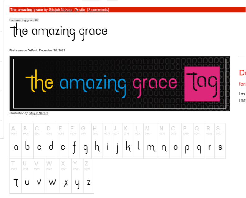
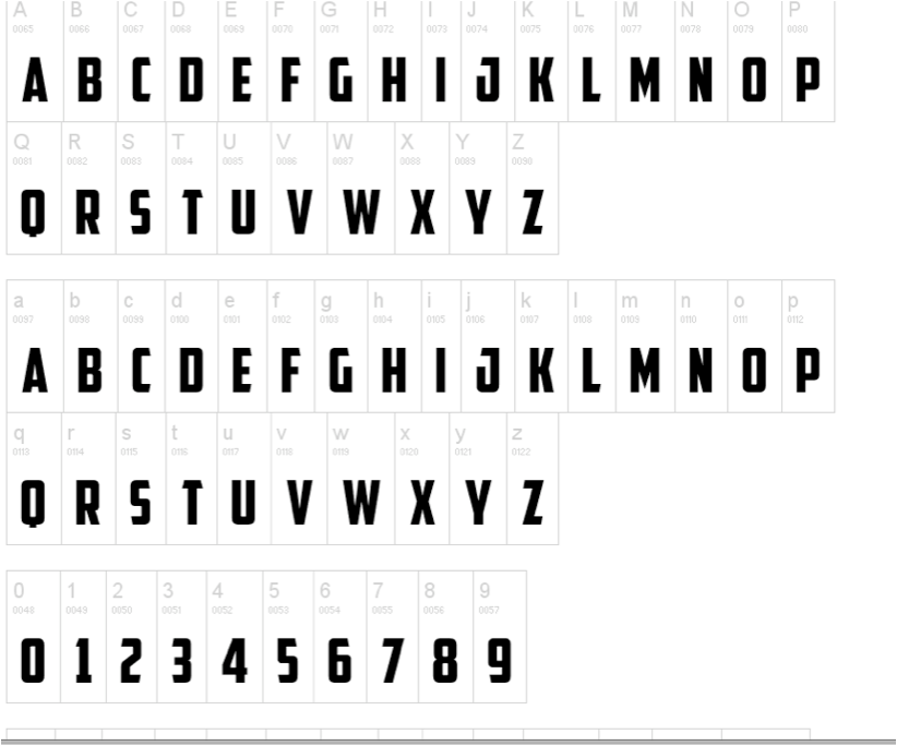
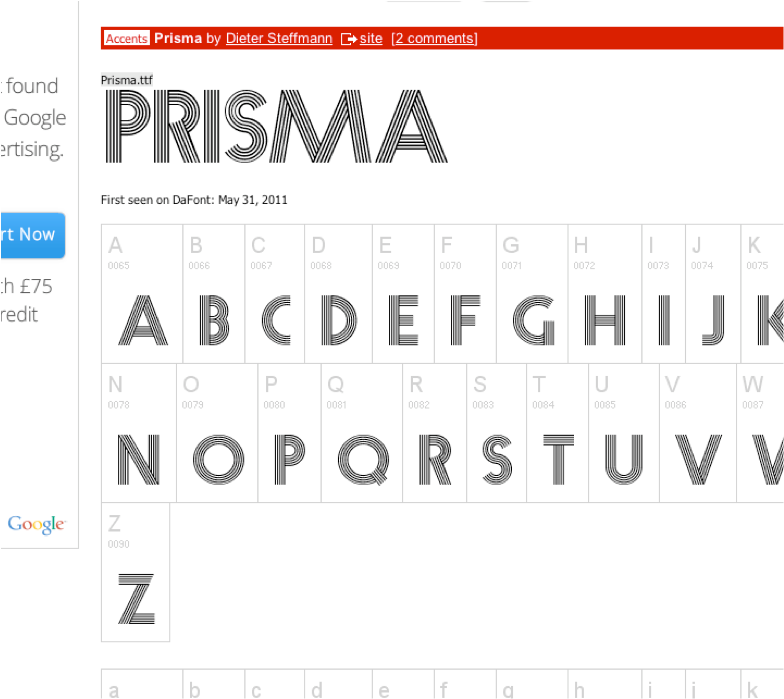
For our ancillary tasks we researched different fonts online and experimented with different colours and styles in order to find one we were happy with to use on our ancillary tasks. Similar to the decision to keep the house style of images black and white, we decided that we would also keep the text black and white as this shows consistency and we feel it is most aesthetically pleasing. Below are fonts we shortlisted, and so far the favourite font seems to be 'prisma' shown at the top of the screenshots. However we will continue to research into different fonts and styles.

Once we have reached a decision on what font to use, we will download it into photoshop so we can use it.
_____________________________________________________________
Thursday, 30 January 2014

Action Plan for Week Commencing

_________________________________________________________________
Action Plan for Week Commencing:

  • Continue with blog work
  • Make final alterations to music video
  • Shoot ancillary images and edit
_________________________________________________________________
Saturday, 18 January 2014

Feedback from Second Draft Music Video

_________________________________________________________________
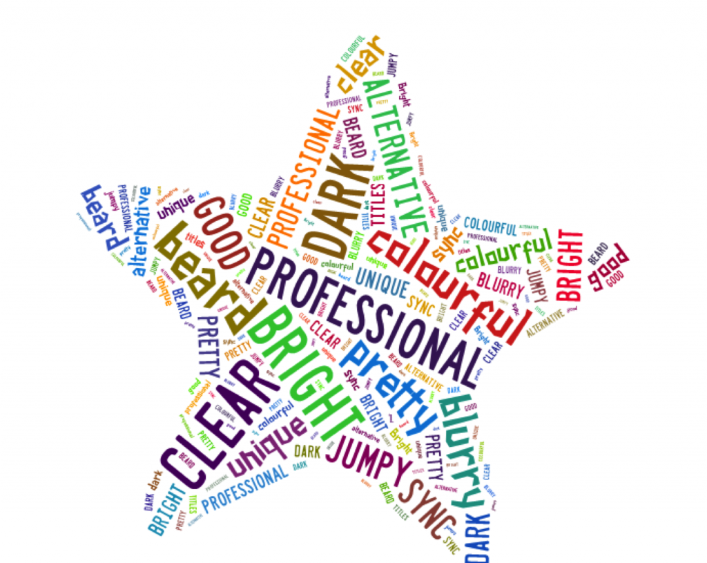
Below is a collaboration of words that were given to us when we showed target audience members the second draft of the music video. It indicated to us that whilst we were doing positively on actors image, professional shots, clear narrative and creativity of the production we needed to work on the overall sync of the video, the lighting in some areas, and the image quality.


_________________________________________________________________