_________________________________________________________________
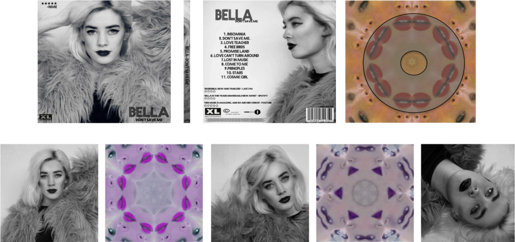
Front Cover Final
Above is the final piece for the front cover of the digipack. The font Prisma was included as planned, however to make the album look more professional, a record label logo was added, and a small 5 star rating in the corner of the album. In real life, this would be more realistic and encourage people to purchase the album rather than it being plain.
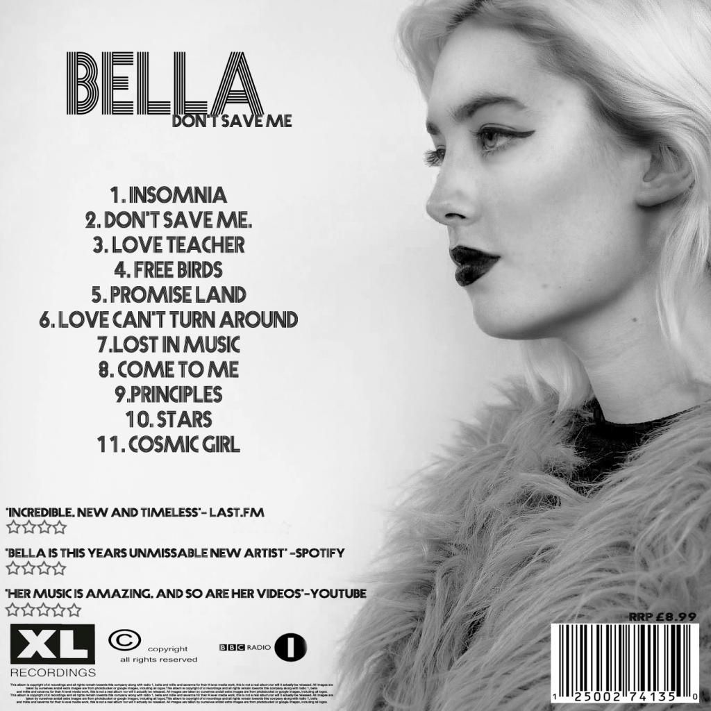
Back Cover Final
This image is the back of the digipack, this includes a track list, a number of reviews, logo's, barcodes, and small print as these are all important features in an album which would appear on a real production. The image is also spaced in a professional way as there are no image-text colour clashes and the text is clear and easy to read.
Spine
A spine was also created for the album cover so that it would be complete. This is simply the edge from the image on the back of the cover so that the two images merge and are consistent. The font is consistent again as we used Prisma throughout the whole pack.
_________________________________________________________________